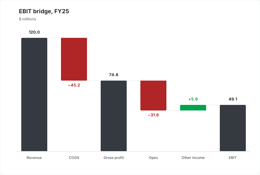
Example waterfall chart showing an EBIT bridge from revenue to operating profit, created with SankeyArt

Waterfall charts that explain the numbers

Build EBITDA bridges and profit walks that look like they came from a top consulting deck - in minutes, not hours.


When to use a waterfall chart

A waterfall chart is the right choice for

Explaining the difference between two values step by step

EBITDA bridges, profit walks, budget variances

Showing which steps helped and which hurt

Waterfall chart examples

Four ways finance teams use waterfall charts, all built in the same editor.
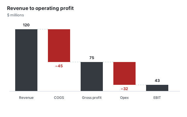
Waterfall chart example bridging revenue to operating profit
Profit bridge Revenue down to operating profit
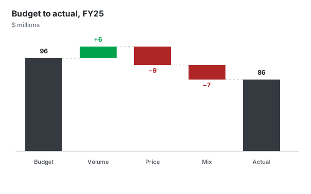
Waterfall chart example explaining the variance between budget and actual
Budget variance Why actuals missed the plan
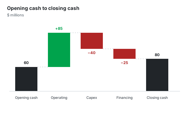
Waterfall chart example walking from opening cash to closing cash
Cash flow walk Opening cash through to closing cash
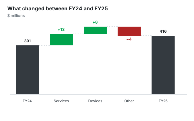
Waterfall chart example walking from last year's revenue to this year's
Year-over-year walk What changed between two years

Built for professional presentations

On-brand by default

Set your corporate colors and fonts once. Every waterfall chart you create follows your corporate design automatically - no manual restyling.

From data to diagram in seconds

Paste your numbers or type them in directly - no sign-in hoops and no clunky menus, just a beautiful chart.

Export anywhere

Download as high-resolution PNG or SVG and drop your chart into PowerPoint, Google Slides, reports, or web pages.

Frequently asked questions

Everything you need to know about creating waterfall charts with SankeyArt

Waterfall charts explain the difference between two values step by step. Typical uses in finance are EBITDA bridges, revenue-to-net-income walks, budget versus actual variance analyses, and cash flow explanations.

Yes. You can add intermediate totals - for example Gross Profit between Revenue and EBITDA - so the bridge reads exactly like your income statement.

Yes. Like our Sankey diagram editor, the new chart editors are built for on-brand output: you set your corporate colors and fonts once and every diagram you create uses them automatically.

Yes. You can download your chart as a high-resolution PNG or SVG and drop it straight into PowerPoint, Google Slides, reports, or web pages.

The editor is under active development. Click "Create diagram" and join the waitlist with your email address - we notify you the moment you can create your first diagram. Waitlist members get access before the public launch.

Create beautiful diagrams the easy way

Don't waste your time with complex software.