
Turn financial statements into beautiful Sankey diagrams


Sankey diagrams speak louder than tables
Our editor makes creating professional diagrams easy
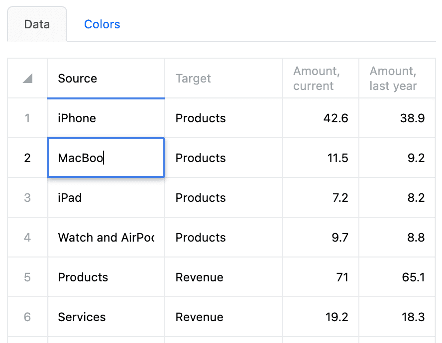
Simple data input
- Spreadsheet interface
- Last-year column for automated year-over-year calculations
- Copy and paste values from Excel or Google Sheets
Customizable style
- Drag and drop nodes
- Add currency symbols
- Use suffixes such as B for billion
Finance leaders use SankeyArt to communicate effectively

As CFO I look for ways to showcase data, and we wanted to use Sankey graphics for our financials.
There were a number of companies and software providers offering ‘easy’ solutions.
We explored many of them, and found SankeyArt to have a very clean and user-friendly interface, quick and extremely cost effective.

It's rare to come across a product that is so super-easy to use and intuitive as SankeyArt is.
15 minutes was all it took to learn and generate an awesome page for my board report and my monthly opex infographics will be far more interesting-- I hope nobody figures out my secret...

If I were an accountant in public practice, I would look to produce one of these graphs for all my customers.
This is far better than just sending them an income statement.Enterprise-grade security
Your financial data deserves the highest level of protection. SankeyArt provides enterprise-grade security with ISO 27001 certification, GDPR compliance, encryption, and single sign-on for peace of mind.
ISO 27001
Our information security management system is certified to the ISO/IEC 27001:2022 standard.
GDPR & privacy compliance
Full GDPR compliance with transparent data processing and user rights management.
Single sign-on
Seamless Google and Microsoft SSO integration with MFA inheritance. SAML-based SSO on our enterprise plans.
Security documentation for procurement teams
Architecture diagrams and compliance attestations for vendor evaluations. Visit Trust Center
Create beautiful diagrams the easy way
Don't waste your time with complex software. Start by altering one of our example diagrams instead.
Create diagram