Blog
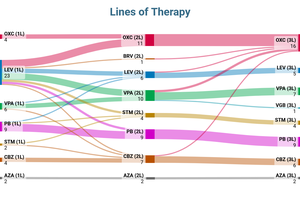
How to visualize lines of therapy charts
Filip Barl | June 17, 2026Learn how to create and customize lines of therapy charts with Sankey diagrams. A practical way to visualize treatment pathways, therapy switches and healthcare flows.
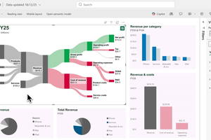
How to create and customize Sankey diagrams in Power BI
Filip Barl | Feb. 18, 2026Struggling to visualize flows in Power BI? Sankey diagrams make complex relationships intuitive.
Design principles behind a viral Sankey diagram
Abhay Singh | June 17, 2025A few of my Sankey diagrams went viral on Reddit. They hit millions of views. The secret? Not just good data - good design.

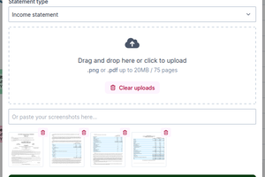
Introducing PDF smart imports ✨
Filip Barl | March 28, 2025We’re thrilled to announce the launch of Smart import, a powerful new feature that allows you to upload PDFs or images of your financial data and generate a Sankey diagram from it effortlessly!
What others are saying about SankeyArt
Andreas Haselsteiner | March 11, 2025Every now and then, I come across people writing about SankeyArt online. Here are a few mentions I’ve found: The original launch post on Reddit. When we first launched SankeyArt, I shared it on r/SideProject ...
New: Set organization-wide brand colors in SankeyArt
Andreas Haselsteiner | Feb. 10, 2025You can now save your brand colors directly in SankeyArt. No more hunting for hex codes—your brand colors are always ready when customizing flows in your diagrams.

What is a Sankey diagram and who is Captain Sankey?
Andreas Haselsteiner | Oct. 29, 2023A Sankey diagram visualizes the flow of a resource, such as energy, water, or money. It consists of interconnected lines where each line represents the amount of flow. Popular use cases are material flow analysis and financial data reporting.

Sankey diagrams of the job search process
Andreas Haselsteiner | April 13, 2023The job search process can be visualized with a Sankey diagram. That's because job hunting follows clear steps and can be thought of as a flow of applications that finally lead to offers. And flows are best visualized with a Sankey diagram.

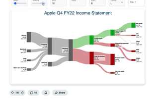
Why a Sankey diagram is the best way to visualize an income statement
Andreas Haselsteiner | March 2, 2023Income statements are usually presented as tables. There is nothing wrong with tables. But good visualizations make numbers more intuitive. The best type of visualization for an income statement is a Sankey diagram. Let me explain why.
