Why a Sankey diagram is the best way to visualize an income statement
Andreas Haselsteiner
| March 2, 2023
March 2, 2023
The P&L: My favorite financial statement
If I'd have to pick one document to understand a business, I would pick the income statement. The income statement -- some people simply call it the "P&L" -- tells us how a company generates revenue, how it spends it, and whether the company makes a profit. Sure, the balance shows if the business owns anything of value or if it is overloaded with debt. And the cash flow statement tells us if there is hard cash coming in. But there is a reason why in earning reports the income statement is usually presented before these other two.
Income statements are usually presented in tables. The top row describes how much revenue is generated and subsequent rows contain different kinds of costs. The very bottom tells us the amount of profit (or loss) the business makes.
There is nothing wrong with the typical table-form presentation.
Nevertheless, to most people, a good visualization is more intuitive than a table.
Typical charts to visualize an income statement
Probably the most common visualization of an income statement is a waterfall diagram.
Its structure is similar to the income statement in table form: The very top bar shows revenue. Subsequently, one bar represents one line of the table -- showing us how costs slowly eat up revenue.
Here is a great example of a waterfall diagram from a LinkedIn post by Kamil Franek:

Personally, I need to think for a couple of seconds to "get" the diagram. But then it's intuitive and helpful: Because the length of each bar corresponds to the dollar amount, my brain can put the size of the different numbers into perspective.
Another common choice to visualize bits of an income statement is a bar chart. One can either have multiple charts to cover different metrics of interest -- revenue, gross profit, operating profit, R&D expenditures, and so forth -- or one can use a grouped bar chart to display all metrics of interest in a single diagram.
Here is a grouped bar chart with two metrics from Tesla'a investor presentation:

The chart very intuitively shows how the metrics "net income" and "earnings before interest, taxes, depreciation, and amortization" (EBITDA) changed over time. The chart, however, does not tell us anything about the other lines in the income statement. We would need a lot of these charts to cover the full income statement table.
These two types of charts -- waterfall diagram and bar chart -- are solid choices to visualize a P&L but they have some disadvantages.
A waterfall diagram visualizes all lines of the income statement but
- It is not very intuitive to most people. I need to look at it for a couple of seconds to understand it.
- It does not visualize the branches of an income statement: It does not show that, for example, operating expenses contain both, costs for R&D and costs associated with selling.
A bar chart is very intuitive but
- It cannot show all lines of an income statement in conjunction and
- It does not visualize the structure of the income statement (it does not show if a metric is a cost or an income and from which other metric it is subtracted or added)
I was trained as a scientist. During my PhD, I loved to nerd out to find the best way to present my data. Usually, there is one type of diagram that fits best for a given dataset. The type of diagram depends on the structure of the data and the story you want to tell.
Let's look at the data structure of an income statement and think about which kind of stories we want to tell with it.
The structure of an income statement
An income statement has a natural beginning, the amount of revenue coming in, and a natural end, the bottom line. If the bottom line is positive the company made a (net) profit. If it is negative, the company made a loss.
Between the beginning and the end, we subtract expenses and sometimes add special types of income. Sometimes we group expenses together -- expenses for sales, administrative tasks, research and product development are grouped as "operating expenses" -- and sometimes we calculate subtotals to summarize them as a new metric. For example, subtracting all the operating expenses from gross profit gives us the metric "operating profit". Income statements can have different metrics grouped together and these metrics can be negative or positive depending on the business. Besides this, one thing is true for all income statements: All the revenue coming in must go somewhere. Inflows and outflows must be balanced.
The structure of an income statement can be thought of as a river: Multiple streams -- the various revenue sources -- rejoin to form a proper river. As the river flows along and gets closer to the sea it splits and forms a delta. One of these river delta arms is used by humans to spin a turbine to produce electricity. While the people living around this river care about the overall health of the river, they are most interested in the arm that spins their hydropower turbine. Two years ago there was a drought that caused the hydropower river arm to almost dry up. Only by sealing one of the other arms they kept their turbine spinning.
Ok, enough of this bad analogy.
The data structure of an income statement can be represented as flows. And the stories we want to tell with the income statement often benefit if we can tell how the streams of revenue flow towards our favorite river arm, the net profit line.
Therefore, a flow diagram should be a good choice to visualize an income statement.
Why Sankey diagrams are the perfect fit for income statements
There are different types of flow diagrams. If we draw the flow proportional to the number of dollars, we draw a Sankey diagram. Our monkey brain likes it if numbers are visualized by things that are proportional to the numbers. So our ideal diagram should have this feature.
Let's take Apple's income statement visualized as a flow diagram to understand why a Sankey diagram works so well for this type of data.

We can immediately grasp the meaning of the diagram: We read it from left to right and see how individual revenue streams for iPhone, MacBook, iPad, Watch and AirPods together make up the product revenue. We also easily see that most of the revenue is coming from iPhone sales. The second biggest revenue stream is based on services.
As our eyes wander towards the right we see that more than half of the overall revenue is spent on costs of revenue. Almost all of it goes towards product costs -- the bill of material of the gadgets, the electricity for the factory, and the salaries of the workers who assemble the gadgets. A much smaller portion of the costs of revenue is required to produce and deliver the services. Running servers is less expensive than producing and assembling electronics.
As the green river of profit flows further to the right, arms representing operating expenses and taxes reduce the width of the stream. Nevertheless, a thick line representing almost 100 billion dollar remains as net profit in the end.
This Sankey diagram contains the complete information of the income statement: The amounts of all items are represented by the width of the streams and the inherent structure of the income statement -- which items are added and how are they grouped -- is represented by how flows divide and join each other.
That's great! A Sankey diagram is an ideal visualization of an income statement because it can represent the statement's complete information in the simplest possible form.
Some companies report year-over-year changes in their earnings report as an additional column for the income statement. This allows readers to understand the dynamics of the business. While there is no simple way to add this information visually to a Sankey diagram, we can add the year-over-year changes to the node labels.
Here is how Apple's Sankey diagram looks with year-over-year labels added:

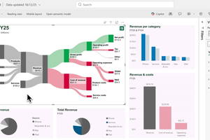
How to visualize an income statement as a Sankey diagram
To turn a table-format income statement into a Sankey diagram we need to put it into the right data format. We need to define the flows by specifying pairs of nodes and the number of dollars flowing between the two.
The data input for Apple's Sankey diagram looks like this:

Finally, we need software to turn this data into a beautiful Sankey diagram.
We develop SankeyArt to make the process of visualizing financial statements -- and especially income statements -- as easy as possible: That's why we use a spreadsheet input, why we automatically detect whether a flow represents a profit or expense to color it green or red and why we let you add labels that show the year-over-year change of each item.
Give it a try. No registration is required. This link takes you directly to the diagram maker.
And please let me know if you have ideas for improving the look of the Sankey diagrams or the process of creating them. Email or tweet me.

Andreas Haselsteiner
Andreas co-founded SankeyArt, enjoys writing software, and loves great visualizations.
He is an engineer, holding a PhD in mechanical engineering from University of Bremen.