What is a Sankey diagram and who is Captain Sankey?
Andreas Haselsteiner
| Oct. 29, 2023
Oct. 29, 2023
Sankey diagram definition
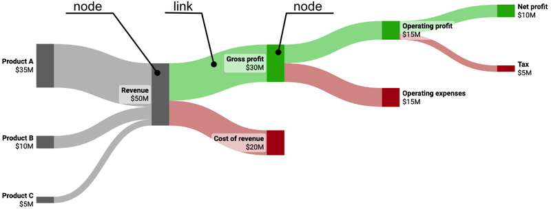
A Sankey diagram visualizes the flow of a resource, such as energy, water, or money.
It is a special type of flow diagram and consists of a series of interconnected lines that represent the flows. The width of each line represents the amount of flow. The connecting lines are called “links” and the connection points are called “nodes.”

History and origin
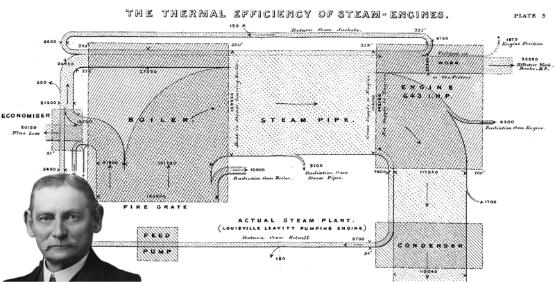
The Sankey diagram takes its name from the Irish captain and engineer Riall Sankey. He created such a diagram in 1898 [1] while working on steam engines. His work aimed to visualize the efficiency of steam engines by illustrating the flow of energy from the heat source, the boiler, to various components of the engine.

Captain Riall Sankey and his diagram of the efficiency of steam engines. Image sources: diagram [1], portrait [2].
Over the years, Sankey diagrams have evolved and expanded in their applications. Today, they are used in diverse fields, from environmental studies to finance and process optimization.
Examples and use cases
Sankey diagrams are great for all use cases where a flow shall be visualized that splits into sub-flows and where the volume of the sub-flows is important.
Energy production and storage is a typical use case. The Sankey diagram below is about hydrogen round-trip efficiency: It shows where energy is lost in a round-trip of electricity-based hydrogen production, hydrogen storage, and electricity generation from the hydrogen. The efficiency of such a round-trip is typically between 18% and 46% [3]. In the shown configuration it is 40%.

Hydrogen round-trip efficiency.
Sankey diagrams are also well-suited to visualize flows of money. Actually, I am convinced that the Sankey diagram is the best type of visualization for an income statement. I wrote a lengthy blog post on why I think that. Below is a Sankey of Apple’s 2022 income statement.

Apple’s income statement for the fiscal year 2022. Data source: [4].
Most people can immediately grasp the meaning of the diagram. They understand how revenue streams for iPhone, MacBook, iPad, Watch, and AirPods together make up the product revenue and they see that most of the revenue is coming from iPhone sales. The second biggest revenue stream is based on services. Of course, this information could also be presented in a typical table format, but for most people, a Sankey diagram is more intuitive.
Lately, Sankeys got popular on Reddit to visualize the outcome of job hunts. I collected a couple of these Sankeys in a past blog post. Here is the outcome of a guy who was job-hunting for five weeks for a marketing analyst role. Applying to thirty-two jobs resulted in two offers.

Results of a job hunt. Data source: [5].
Software to create Sankeys
Our software SankeyArt is designed to let users create Sankeys as easily as possible. It offers a spreadsheet interface to define nodes and links and does not require registration to get started. Clicking here takes you to the Sankey editor.
We think SankeyArt is the best software to create Sankeys.
Please email me if you like something better from another software. We're continuously improving SankeyArt.
Sankey diagram FAQ
When to use a Sankey diagram?
Sankey diagrams are best used to visualize data where a flow splits into sub-flows. The flowing resource could be anything: energy, material, or money. Engineers use Sankey diagrams in material flow analysis. CFOs, financial analysts, and consultants use them to analyze financial data.
How do Sankey diagrams work?
Sankey diagrams are flow diagrams where the width of the flow is proportional to the volume of the flow. For example, if energy flow is visualized, a line representing 10 MW of energy would have double the thickness of a line representing 5 MW of energy.
How to create a Sankey diagram?
To create a Sankey diagram, you need to first transform a dataset into a specific data structure: a list of flows that are described by a starting point (“node 1”), an ending point (“node 2”), and the amount that flows between these two points. Then you need software to create a diagram based on this data structure.
Article sources
[1] Sankey, H. R. (1898). The thermal efficiency of steam-engines. https://doi.org/10.1680/imotp.1898.19100
[2] Wikipedia, wikipedia.org
[3] Data by Arjun Flora according to an S&P Global article from June 24, 2021, spglobal.com
[4] Apple’s form 10-K, cloudfront.net
[5] Reddit post, reddit.com/r/dataisbeautiful

Andreas Haselsteiner
Andreas co-founded SankeyArt, enjoys writing software, and loves great visualizations.
He is an engineer, holding a PhD in mechanical engineering from University of Bremen.

