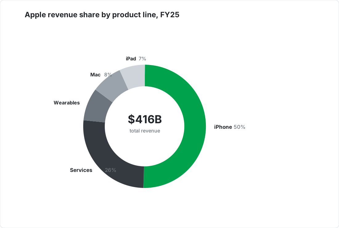
Donut charts that show shares and the total
Split a whole into parts and put the headline number in the middle - on-brand by default.






When to use a donut chart
A donut chart is the right choice for
A few parts of a whole, total in the center
One dominant share that readers grasp at a glance
A lighter, more modern look than a full pie
Better served by another chart
Donut chart examples
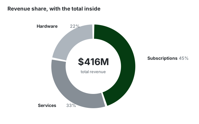
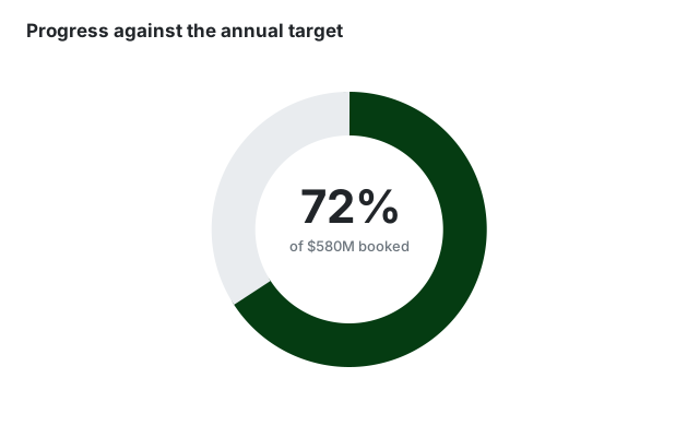
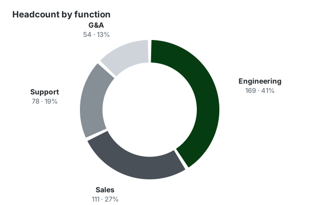
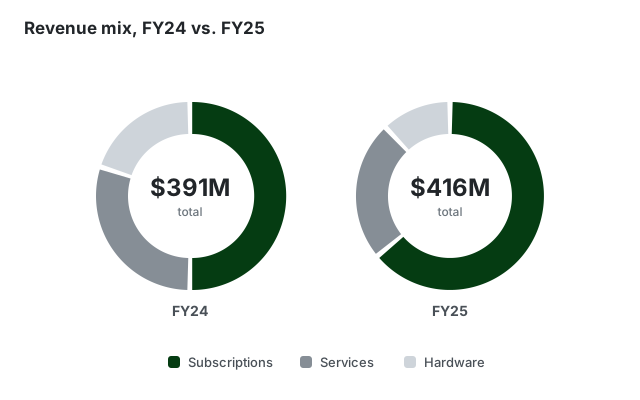
Four ways finance teams use donut charts, all built in the same editor.
Built for professional presentations
On-brand by default
Set your corporate colors and fonts once. Every donut chart you create follows your corporate design automatically - no manual restyling.
From data to diagram in seconds
Paste your numbers or type them in directly - no sign-in hoops and no clunky menus, just a beautiful chart.
Export anywhere
Download as high-resolution PNG or SVG and drop your chart into PowerPoint, Google Slides, reports, or web pages.
Frequently asked questions
Everything you need to know about creating donut charts with SankeyArt
Create beautiful diagrams the easy way
Don't waste your time with complex software.