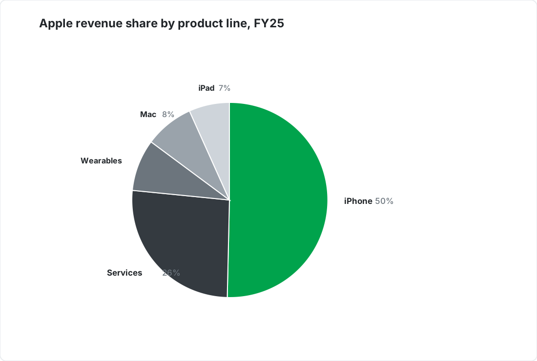
Example pie chart showing Apple revenue share by product line, created with SankeyArt

Pie charts that make shares obvious

Show how a whole splits into parts - with clean labels and your corporate design applied automatically.


When to use a pie chart

A pie chart is the right choice for

A few parts of a whole: market share, revenue split

One dominant share that readers grasp at a glance

Audiences that expect the classic format

Pie chart examples

Four ways finance teams use pie charts, all built in the same editor.
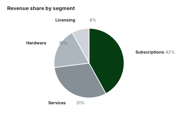
Pie chart example showing revenue share across four segments
A few shares Four slices, clearly labelled
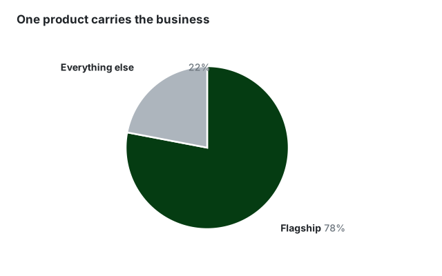
Pie chart example where one product is 78 percent of revenue
One dominant share When the story is the big slice
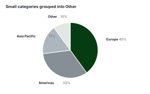
Pie chart example grouping small regions into an Other slice
Grouped into Other Keep small categories tidy
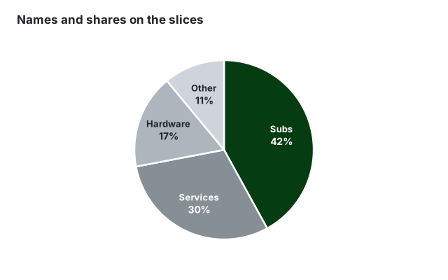
Pie chart example with percentage labels drawn on each slice
Names on the slices Category and share inside each slice

Built for professional presentations

On-brand by default

Set your corporate colors and fonts once. Every pie chart you create follows your corporate design automatically - no manual restyling.

From data to diagram in seconds

Paste your numbers or type them in directly - no sign-in hoops and no clunky menus, just a beautiful chart.

Export anywhere

Download as high-resolution PNG or SVG and drop your chart into PowerPoint, Google Slides, reports, or web pages.

Frequently asked questions

Everything you need to know about creating pie charts with SankeyArt

Pie charts show how a whole splits into parts, for example revenue share by product line or market share by competitor. They work best when one or two slices dominate and the exact values matter less than the overall proportions.

Five or fewer. With more slices the angles become hard to compare and labels start to collide - group small categories into an Other slice, or switch to a bar chart, which stays readable at any category count.

Both show parts of a whole. A donut chart is a pie chart with the center cut out, which frees space for the total or another headline number. Readers judge the segments by arc length rather than slice angle, so a donut works just as well for a handful of categories - pick whichever fits your slide.

Yes. Like our Sankey diagram editor, the new chart editors are built for on-brand output: you set your corporate colors and fonts once and every diagram you create uses them automatically.

Yes. You can download your chart as a high-resolution PNG or SVG and drop it straight into PowerPoint, Google Slides, reports, or web pages.

The editor is under active development. Click "Create diagram" and join the waitlist with your email address - we notify you the moment you can create your first diagram. Waitlist members get access before the public launch.

Create beautiful diagrams the easy way

Don't waste your time with complex software.