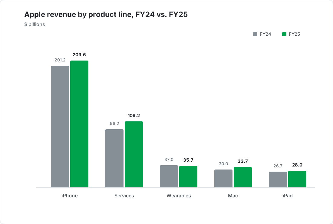
Example column chart comparing Apple revenue by product line for FY24 and FY25, created with SankeyArt

Bar charts that are ready to present

Turn your data into a clean, presentation-ready bar chart - with your corporate colors and fonts applied automatically.


When to use a bar chart

A bar chart is the right choice for

Comparing categories precisely, and ranking them

Comparing periods: this year vs. last year

Breaking a total down into stacked parts

Long category names, laid out as horizontal bars

Bar chart examples

Four ways finance teams use bar charts, all built in the same editor.
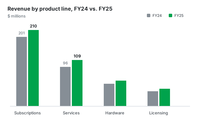
Grouped bar chart example comparing revenue by product line for two financial years
Grouped columns Compare two periods side by side
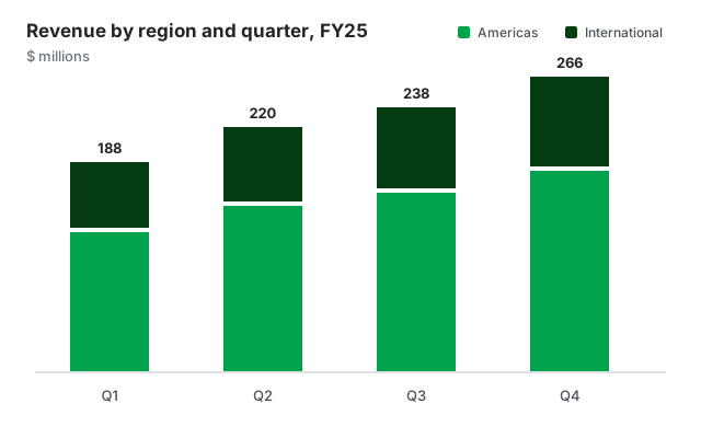
Stacked bar chart example showing revenue by region within each quarter
Stacked columns Show what makes up each total
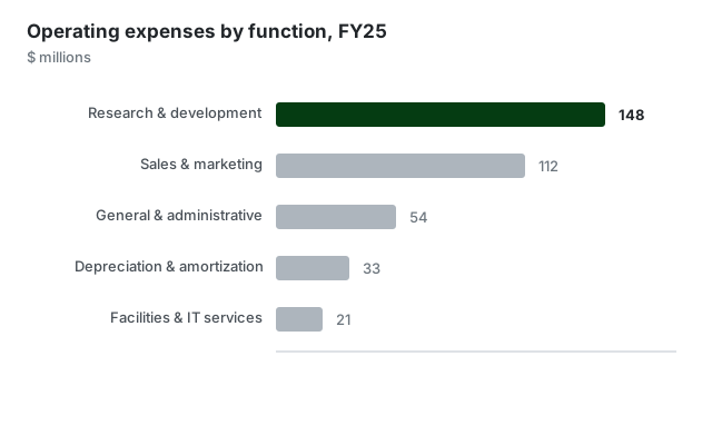
Horizontal bar chart example showing operating expenses by function
Horizontal bars When category names are long
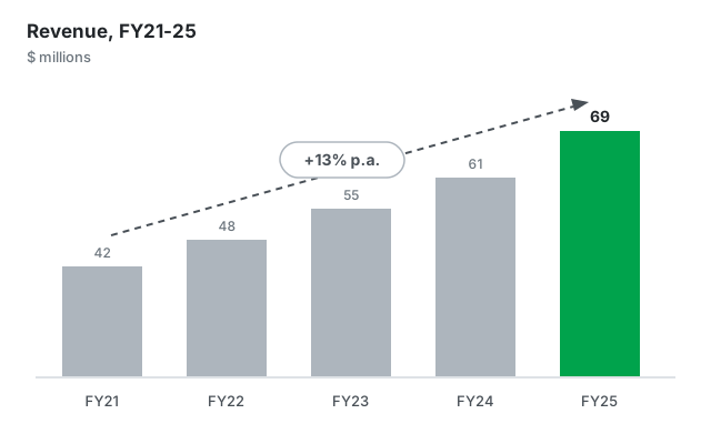
Bar chart example with a CAGR arrow showing compound annual revenue growth
With a CAGR annotation Put the growth rate on the chart

Built for professional presentations

On-brand by default

Set your corporate colors and fonts once. Every bar chart you create follows your corporate design automatically - no manual restyling.

From data to diagram in seconds

Paste your numbers or type them in directly - no sign-in hoops and no clunky menus, just a beautiful chart.

Export anywhere

Download as high-resolution PNG or SVG and drop your chart into PowerPoint, Google Slides, reports, or web pages.
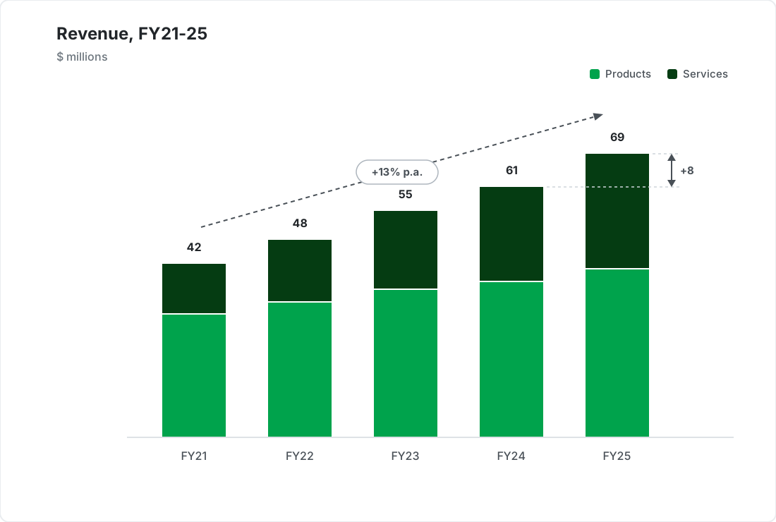
Example bar chart with value labels, a series legend, a CAGR arrow, and a difference arrow, created with SankeyArt

Annotations that tell the story

In business presentations the message often sits between the bars.

  • Labels and legends - value labels on every segment and a clean series legend, no manual text boxes
  • CAGR arrows - show compound annual growth
  • Difference arrows - highlight the gap between two bars, absolute or in percent

Frequently asked questions

Everything you need to know about creating bar charts with SankeyArt

Bar charts compare values across categories, for example revenue by product line, costs by department, or results by quarter. They are the most common chart in business presentations because comparing bar lengths is fast and accurate.

Only the direction. A column chart draws the bars vertically, a bar chart draws them horizontally - Excel and many presentation tools use the two names for exactly that distinction. Use columns for time periods and short category names, and horizontal bars when the category names are long or there are many of them. Our editor does both.

Yes. You can put several series side by side to compare periods - for example this year against last year - or stack them to show how a total breaks down.

Yes. Like our Sankey diagram editor, the new chart editors are built for on-brand output: you set your corporate colors and fonts once and every diagram you create uses them automatically.

Yes. You can download your chart as a high-resolution PNG or SVG and drop it straight into PowerPoint, Google Slides, reports, or web pages.

The editor is under active development. Click "Create diagram" and join the waitlist with your email address - we notify you the moment you can create your first diagram. Waitlist members get access before the public launch.

Create beautiful diagrams the easy way

Don't waste your time with complex software.