Example scatter plot showing store size versus weekly sales for 42 stores, with a trend line and two labeled outliers, created with SankeyArt

Scatter plots that make the pattern obvious

Show the relationship between two variables with a clean, presentation-ready scatter plot - on-brand by default.


When to use a scatter plot

A scatter plot is the right choice for

Relationships between two numeric variables: spend vs. revenue

Many observations, where patterns matter most

Spotting the outlier worth a follow-up question

Scatter plot examples

Four ways finance teams use scatter plots, all built in the same editor.
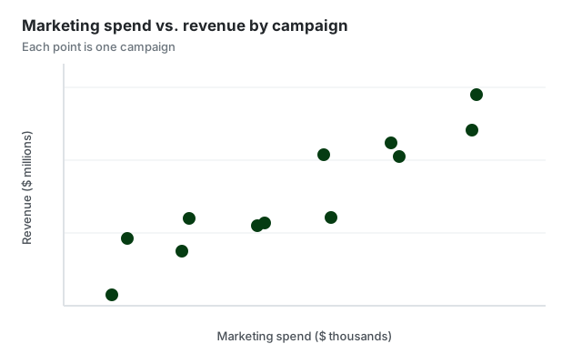
Scatter plot example showing marketing spend against revenue
Correlation Does one variable move with the other?
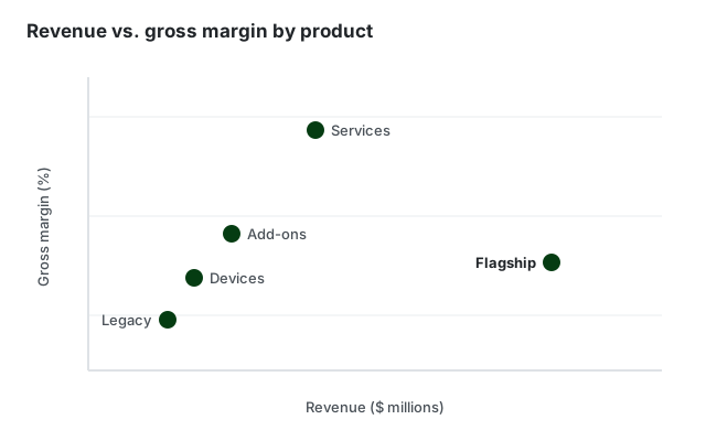
Scatter plot example with named products labelled by revenue and margin
Labelled points Name the items that matter
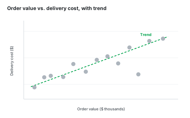
Scatter plot example with a dashed trend line through the points
With a trend line Make the relationship explicit
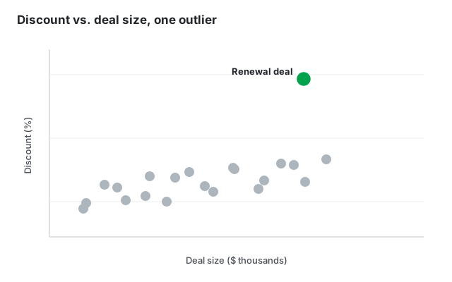
Scatter plot example with one outlying deal highlighted in green
Highlighted outlier Point at the exception

Built for professional presentations

On-brand by default

Set your corporate colors and fonts once. Every scatter plot you create follows your corporate design automatically - no manual restyling.

From data to diagram in seconds

Paste your numbers or type them in directly - no sign-in hoops and no clunky menus, just a beautiful chart.

Export anywhere

Download as high-resolution PNG or SVG and drop your chart into PowerPoint, Google Slides, reports, or web pages.

Frequently asked questions

Everything you need to know about creating scatter plots with SankeyArt

A scatter plot shows the relationship between two numeric variables. Each point is one observation, placed by its value on the horizontal and vertical axis. Patterns in the point cloud reveal correlations, clusters, and outliers.

Yes. You can label points - for example with company, product, or country names - and highlight the points that matter for your story.

Yes. Like our Sankey diagram editor, the new chart editors are built for on-brand output: you set your corporate colors and fonts once and every diagram you create uses them automatically.

Yes. You can download your chart as a high-resolution PNG or SVG and drop it straight into PowerPoint, Google Slides, reports, or web pages.

The editor is under active development. Click "Create diagram" and join the waitlist with your email address - we notify you the moment you can create your first diagram. Waitlist members get access before the public launch.

Create beautiful diagrams the easy way

Don't waste your time with complex software.