Design principles behind a viral Sankey diagram
Abhay Singh
| June 17, 2025
June 17, 2025
A few of my Sankey diagrams went viral on Reddit. They hit millions of views. The secret? Not just good data - good design.

A well-designed Sankey diagram doesn’t just present data- it tells a story, guides the eye, and feels effortless to read. Good design doesn’t have to be complex, it is in fact invisible, and as Dieter Rams put it: “Good design is as little design as possible.”
So, what makes a Sankey diagram’s design “good”?
Proximity
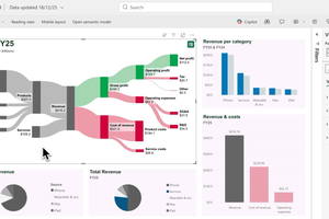
We instinctively perceive objects that are close to each other as related. In your Sankey diagram, place related nodes- like categories or process steps- close together or stack them as readable lists. For example, in the Johnson & Johnson chart above (1.5M views on Reddit), the categories Pharmaceutical and Medical devices are grouped and arranged as well-aligned lists, making the chart easy to scan and understand at a glance.
Similarity
The brain groups things that look alike. Use consistent colors, shapes, and fonts to visually link related elements. For example, assign all “cost” flows in red and all “revenue” flows in green. This reinforces meaning without extra labels.
Figure-Ground
If everything stands out, nothing does. In the J&J chart, the massive “Other” income type entering the gross profit is instantly noticeable- not because it’s louder, but because it’s given space to breathe. Thoughtful use of white space and visual contrast highlights the key story (figure) from the other elements (ground), guiding the eye to what matters. In design, figure-ground refers to how we instinctively distinguish the main focus (figure) from the background context (ground). Our eyes are drawn to what is visually prominent, while everything else recedes. This principle is also employed in the numerous revenue flows, which use a neutral grey palette, allowing the profit flows, rendered in color, to stand out with greater visual impact. Use this in your chart to tell the story you want to highlight.
Continuity
Use smooth, flowing paths between nodes to guide the viewer’s eye naturally along the intended direction. Avoid sharp angles or chaotic overlaps that disrupt the visual rhythm. Case in point: the fluidly drafted revenue flows not only stand out clearly as one entity but also feel pleasant to the eye. In contrast, the sharply angled green “Other” income type disrupts this flow, which is a deliberate visual technique used sparingly to draw attention (reinforcing the figure-ground principle).
Clarity over clutter
Avoid cluttering your chart with too many colors. Stick to a cohesive palette and limit yourself to one or two fonts to keep things clear and professional. Use larger fonts for headlines, and feel free to incorporate your brand colors subtly- but keep the overall design simple. If an element doesn’t serve a purpose, simplify or remove it. Clean design doesn’t just look better- it makes your message stronger.
These ideas are rooted in Gestalt psychology, but you don’t need to study design theory to apply them. You just need to ask: Does this feel clear? Can I understand this at a glance? At the end, good design isn’t decoration- it’s communication. And when your Sankey diagram is designed well, it works hard so the viewer doesn’t have to.


Abhay Singh
Abhay joined the SankeyArt team in 2023. Having studied visual communication and digital media, he brings a thoughtful, design-led approach to crafting clear, visually compelling content for communication and marketing.